The Corporate Source rebrands as Fora: expanding mission, workforce impact, and business solutions
The Corporate Source has officially rebranded as Fora, marking a significant milestone in the organization’s evolution and signaling a new phase focused on expanding its impact on individuals and delivering workforce solutions to the business community.

“This new name reflects our evolving mission and the direction we’re headed as an organization,” said CEO Rammy Harwood. “It marks an expansion of our business and reinforces what we’ve always known: a pride-driven workforce doesn’t just show up, it raises the bar and delivers meaningful value to the clients and communities we serve.”
Harwood said the rebrand reflects a continued commitment to creating accessible employment opportunities for individuals with disabilities, while also strengthening the organization’s ability to support employers seeking reliable, high-quality service solutions.
At the core of Fora’s mission is the belief that meaningful employment should be accessible to all, with a focus on reducing barriers, recognizing talent, and helping individuals thrive in competitive and supportive work environments.
Despite the new name and brand identity, company leadership confirmed there will be no changes to day-to- day operations, employee roles, or responsibilities.
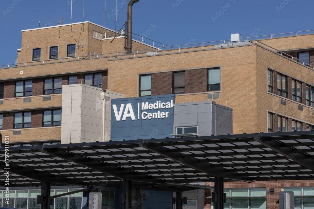
Fora continues to provide janitorial, mailroom, and landscaping services across New York, New Jersey, Puerto Rico, and the U.S. Virgin Islands. The organization is also expanding into technical and IT support services, while building new partnerships across both the public and private sectors.
Harwood emphasized that the organization’s growth is closely tied to its dual mission of workforce inclusion and operational excellence.
“As we grow, our responsibility grows with us,” Harwood said. “We are focused on creating opportunity while also delivering dependable solutions that help organizations operate more effectively.”
The rebrand also introduces a new visual identity, including the Fora Phoenix, a symbol inspired by renewal and resilience, representing both new beginnings and the organization’s continued commitment to progress.
Harwood said the symbol reflects the broader purpose behind the transition.
“This is more than a rebrand—it’s a reflection of who we are and where we’re going”
Rammy Harwood
CEO